Fillable Printable Sample Pareto Form Template
Fillable Printable Sample Pareto Form Template

Sample Pareto Form Template
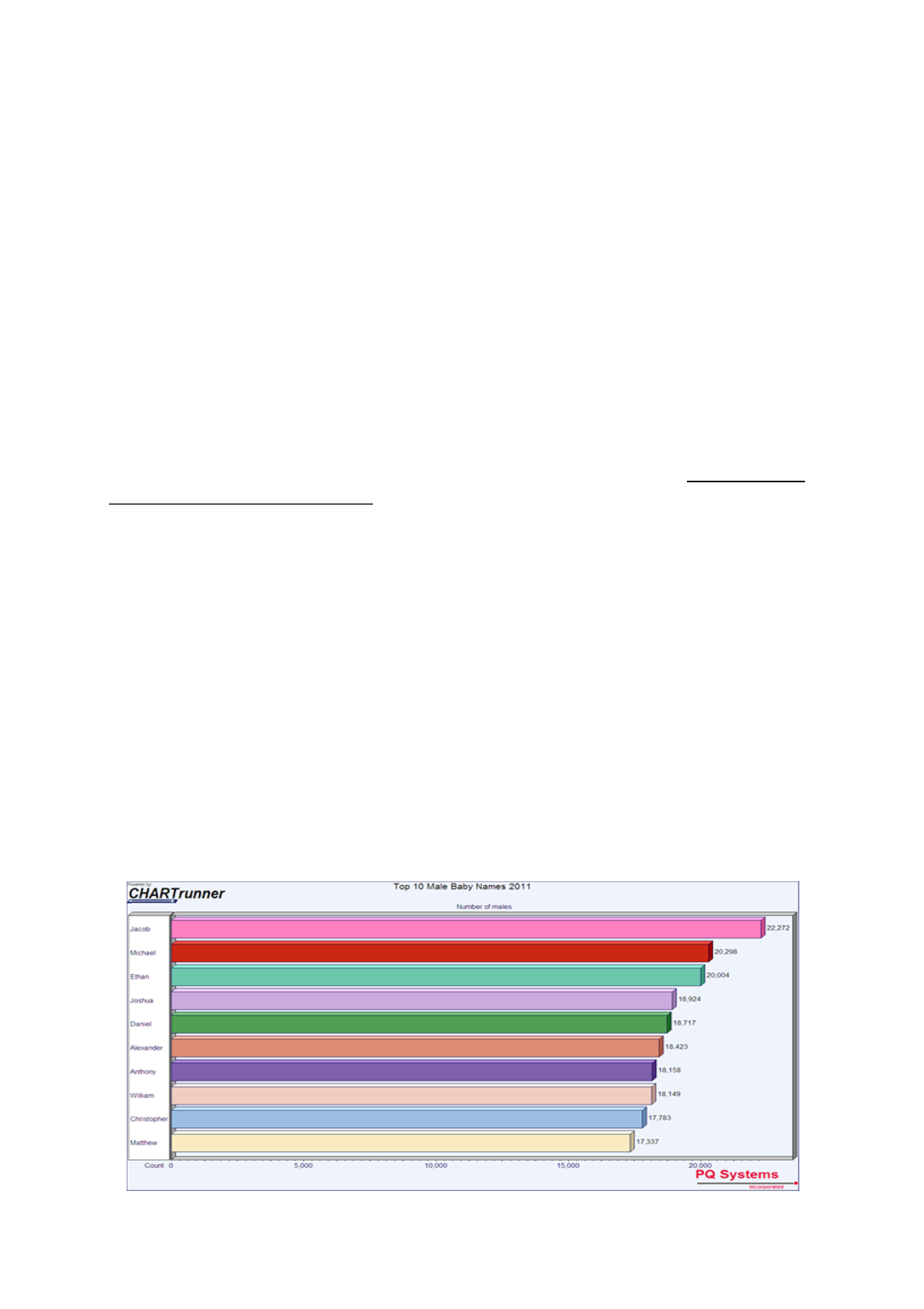
Pareto Diagram
What is it?
The Pareto diagram is a graphical overview of process problems in ranking order from the most
frequent, down to the least frequent. It illustrates the frequency of fault or defect types. Using a
Pareto, you can decide which is the most serious or frequent offender.
The principle was developed by Vilfredo Pareto, an Italian economist and sociologist who conducted
a study in Europe in the early 1900s on wealth and poverty. He found that wealth was concentrated
in the hands of the few and poverty in the hands of the many. The Pareto principle is based on the
unequal distribution of things in the universe.
The basic underlying rule behind the Pareto principle is that in almost every case, 80% of the total
problems incurred are caused by 20% of the problem causes. Therefore, by concentrating on the
major problems first, you can eliminate the majority of your problems. The few problems that occur
most often result in the majority of your defects. You may also have many occasional problems that
cause the occasional defect. This is called the "vital few over the trivial many" rule. Quite often,
once you cure several of the "big hitters" you also eliminate some of the smaller problems at the
same time.
When is it used?
Use a Pareto diagram when you can answer "yes" to both these questions:
1.
Can data be arranged into categories?
2.
Is the rank of each category important?
What does it look like?
An example of a Pareto diagram is shown below.
Creating an Excel Pareto Chart
Before we get into the instructions to create your Excel Pareto Chart there are a few things you
need to do in advance:
•
Decide how you want to categorize your issues. Note: it is considered good practice to have less
than 10 categories.
•
Keep a count of the number of issues in each category. Do this by examining each issue and
adding it to the most appropriate category. You might find yourself changing category names at
this stage once you get into the detail of examining issues.
Now that we have collected the raw data, it’s time to go through the instructions to create our
Excel Pareto Chart:
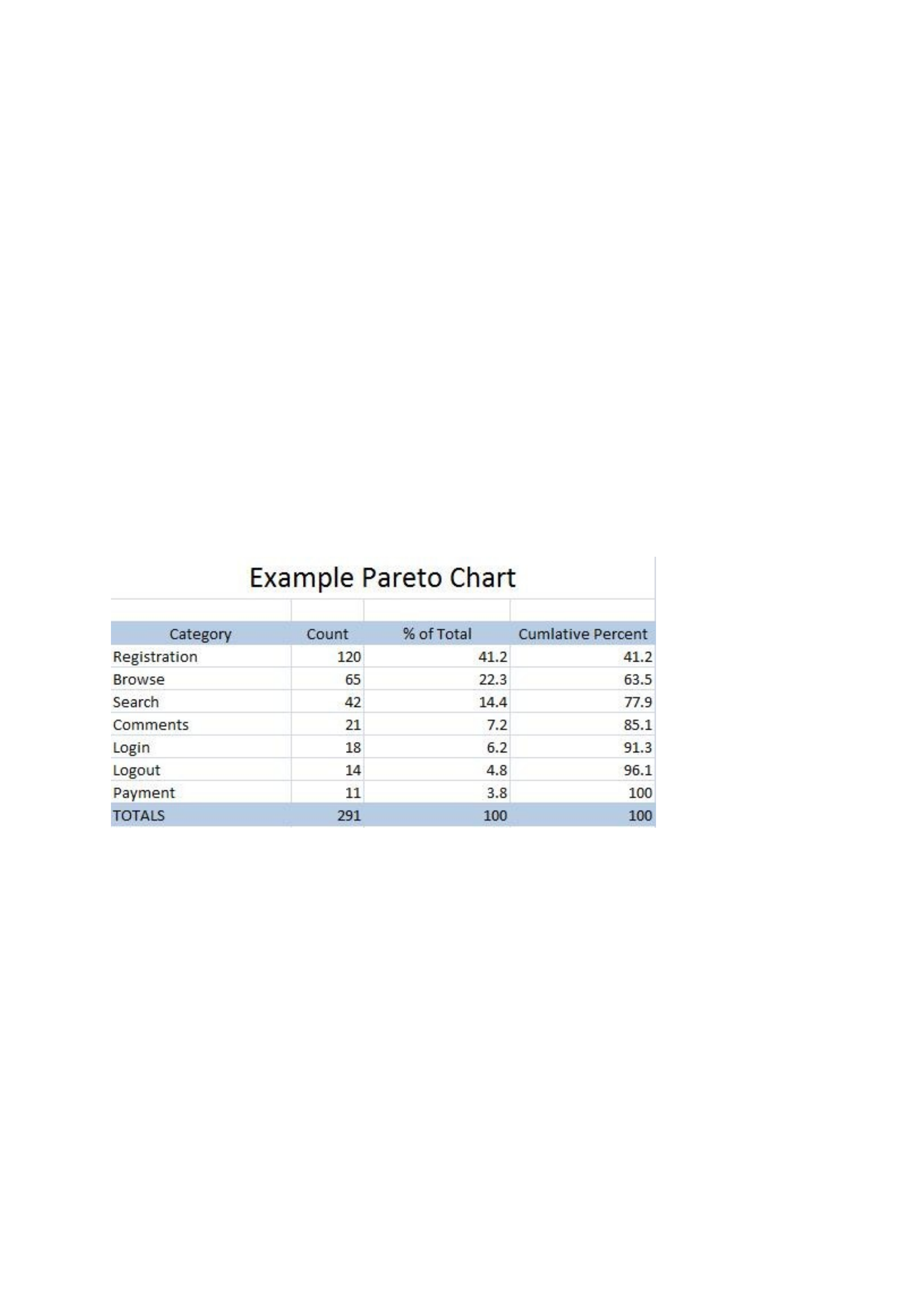
STEP 1: Collect Raw Data in Table Format
The first step is to collect your data into a table similar to the one shown below.
You can create this table yourself, or simply download and modify the Excel Pareto Chart
Template I’ve provided by clicking the link.
STEP 2: Create Basic Table
To begin creating your Pareto Chart in Excel, select the Category column, the Count column, and
the Cumulative Percent column as shown in the diagram below.
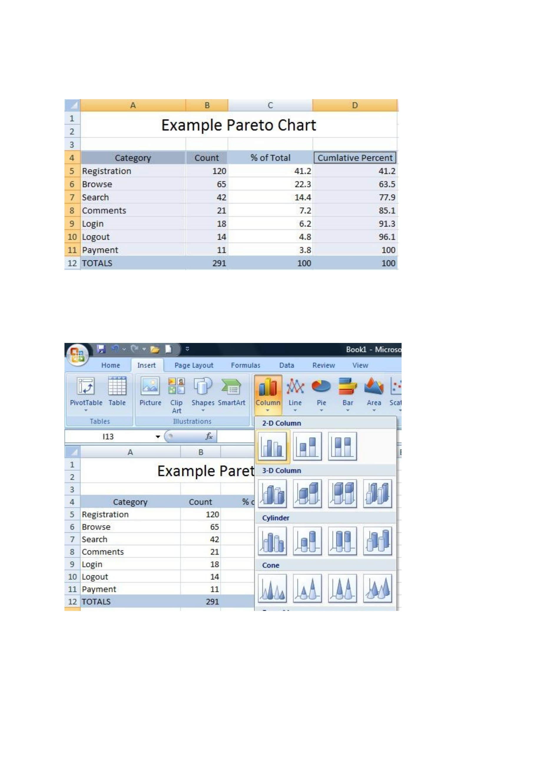
Hold down the Ctrl key to help you in selecting the columns. Notice that you do not select any
data elements from the TOTALS row. Now that you have the right columns selected it’s time to
create the table by selecting the Insert tab in Excel, the Column button, and then choosing
Cluster Column. This is shown below:
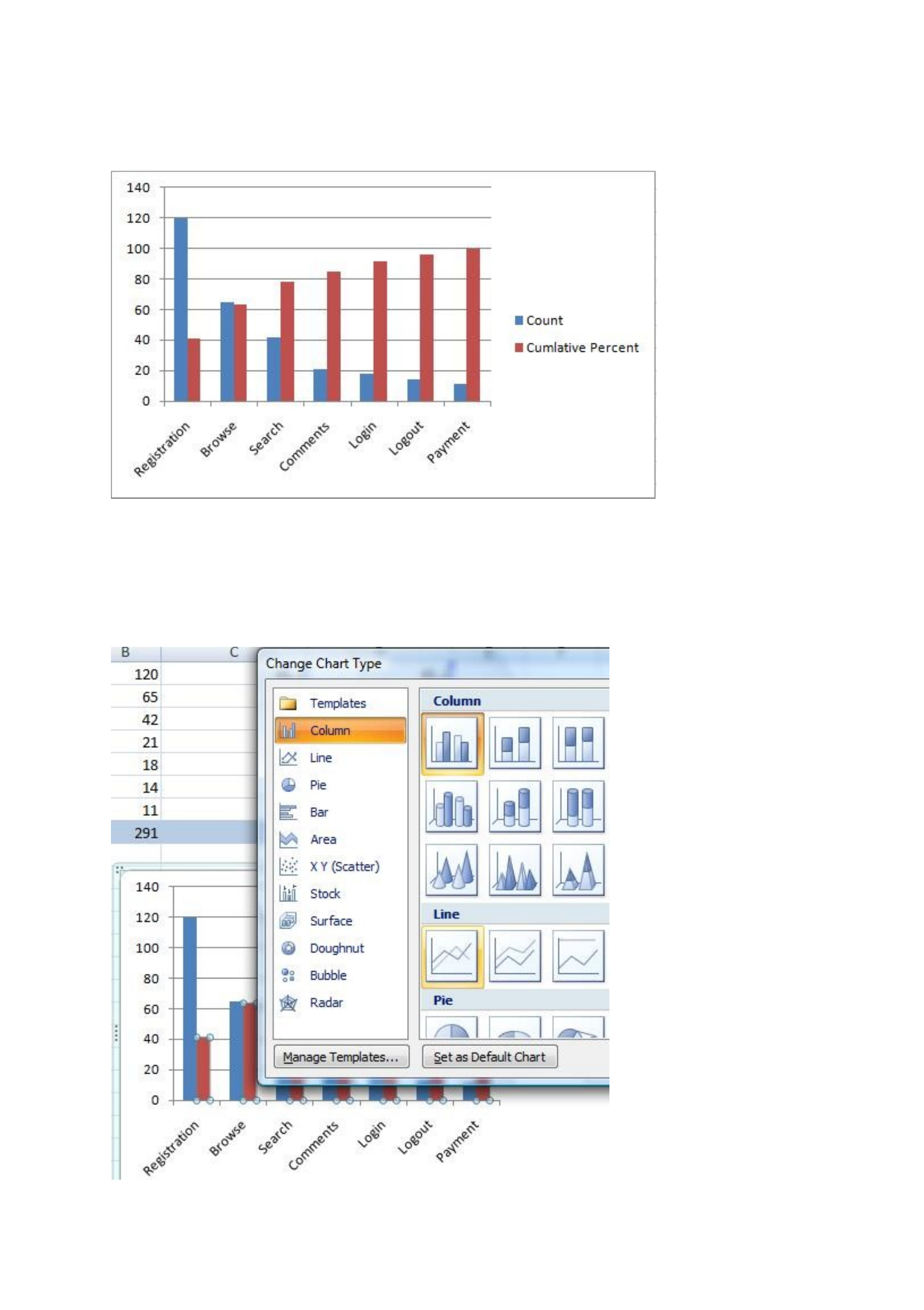
Your Pareto Chart will now look like this:
STEP 3: Create A Basic Pareto Chart
Now that we have our basic diagram, it’s time to make it look more like a Pareto chart. To do
this, right click on any one of the Cumulative Percent bars in the diagram. Select Change Series
Chart Type and then select Line as shown below
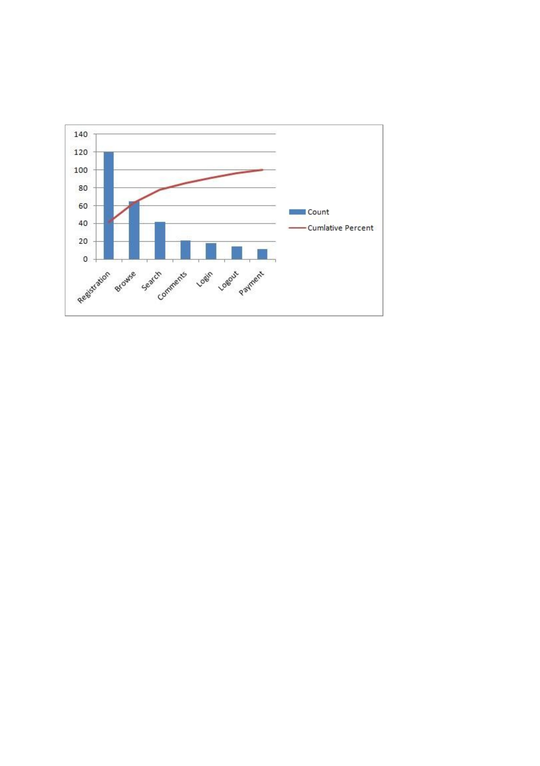
Once you have done this your diagram will look as follows:
STEP 4: Add a Second Axes
You chart should now look like a Pareto Chart, but it will still have just one axis. Now it’s time
to fix this. Do this by right-clicking on the Cumulative Total line and choosing Format Data
Series. Now select the Secondary Axis as shown below:
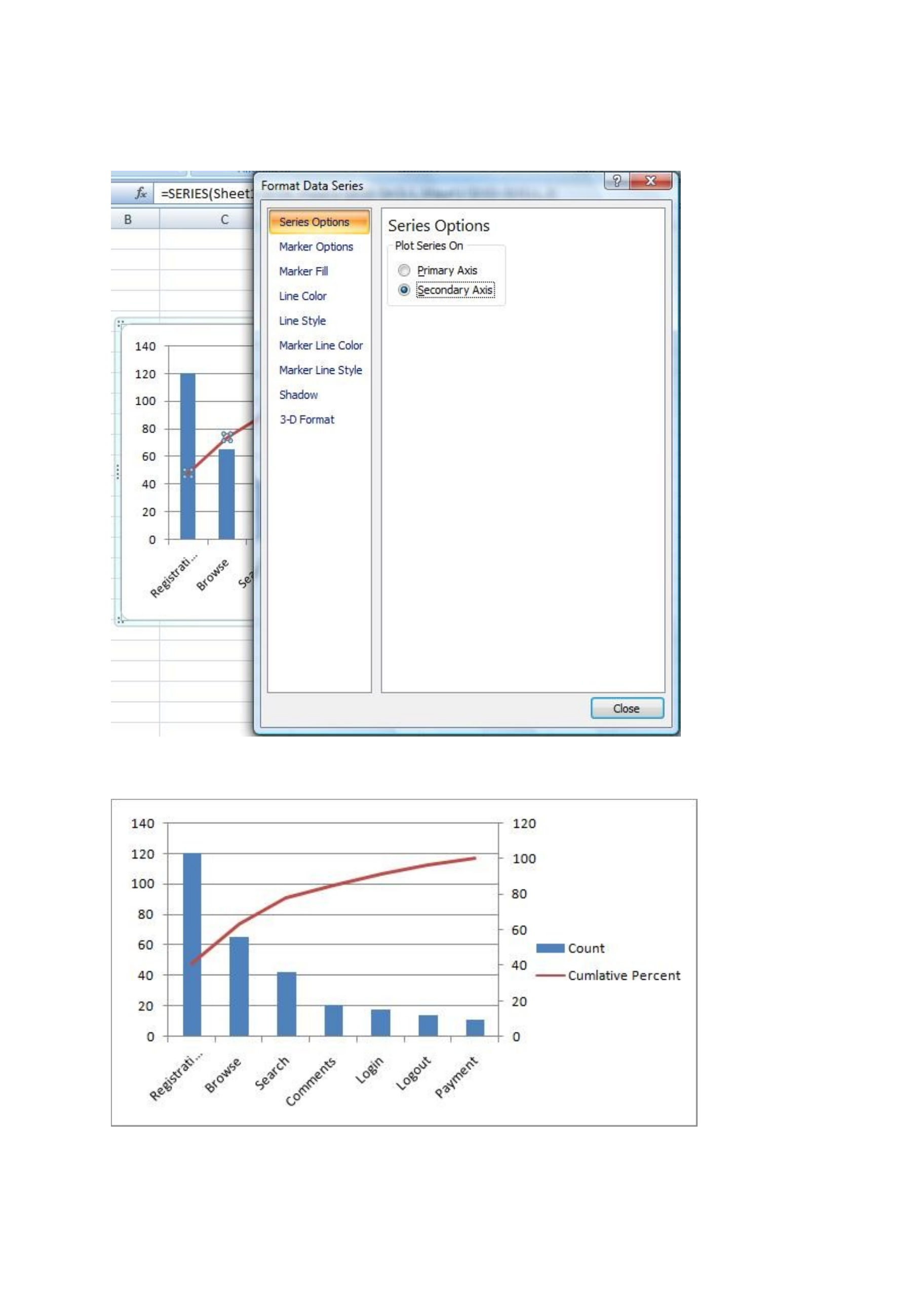
Once you close the pop-up window, you should now see the secondary axis as shown below:
STEP 4: Make it Pretty
Your Excel Pareto Chart is just about done. In fact, you can stop after step 3 if you’re just using
the Pareto Chart for yourself. However, if you’ve intending to show the chart to anyone else then
by following this step you can make it easy for others to understand too.
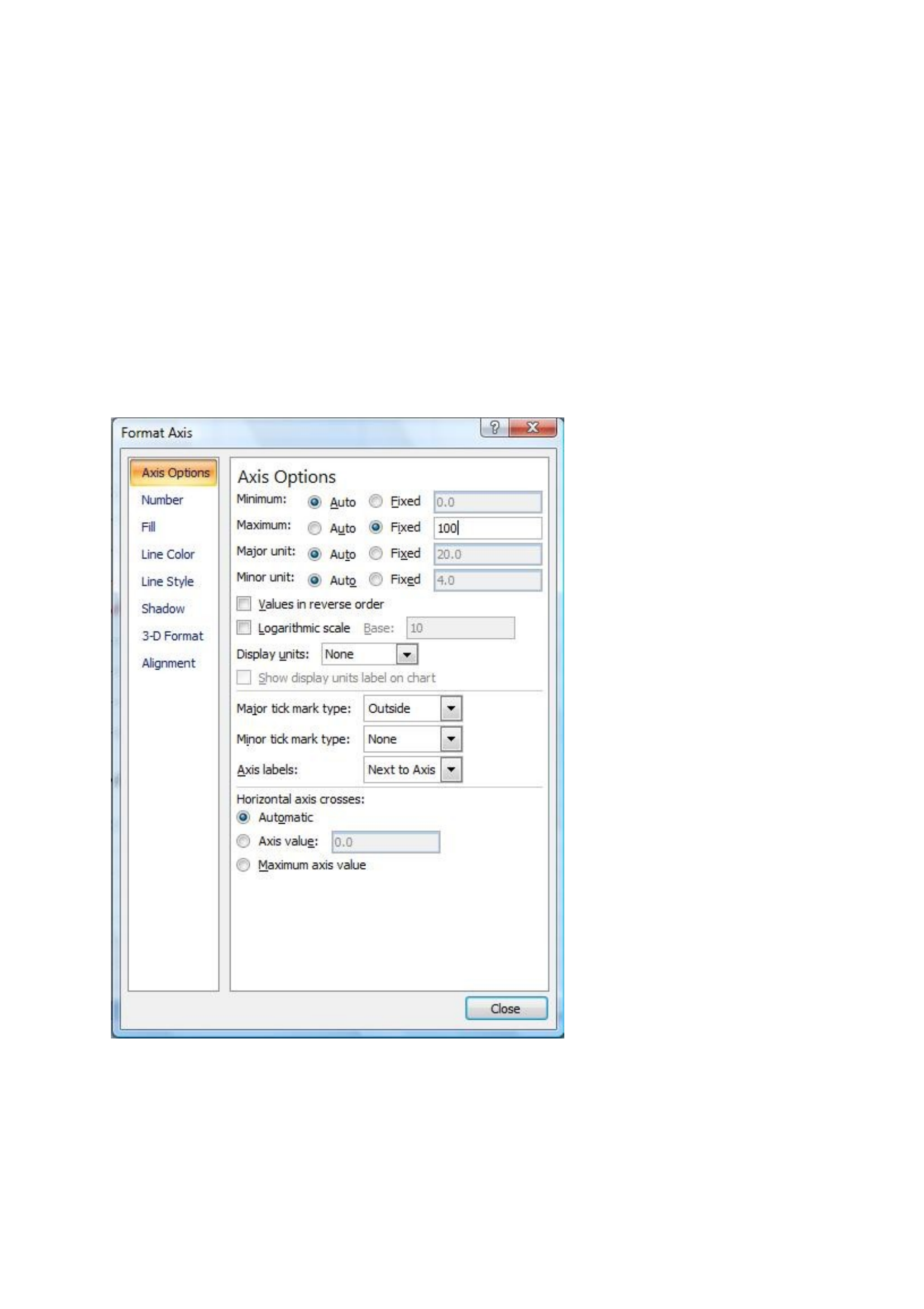
The first thing to do is to get our percent axis to finish at 100% and not 120%. To do this, right
click on the right-hand axis and select Format Axis. Now, under the Axis Options tab select
Maximum to set it to be Fixed, and then manually set the value to 100 as shown in the diagram
below:
This will result in your Pareto Chart looking as follows:
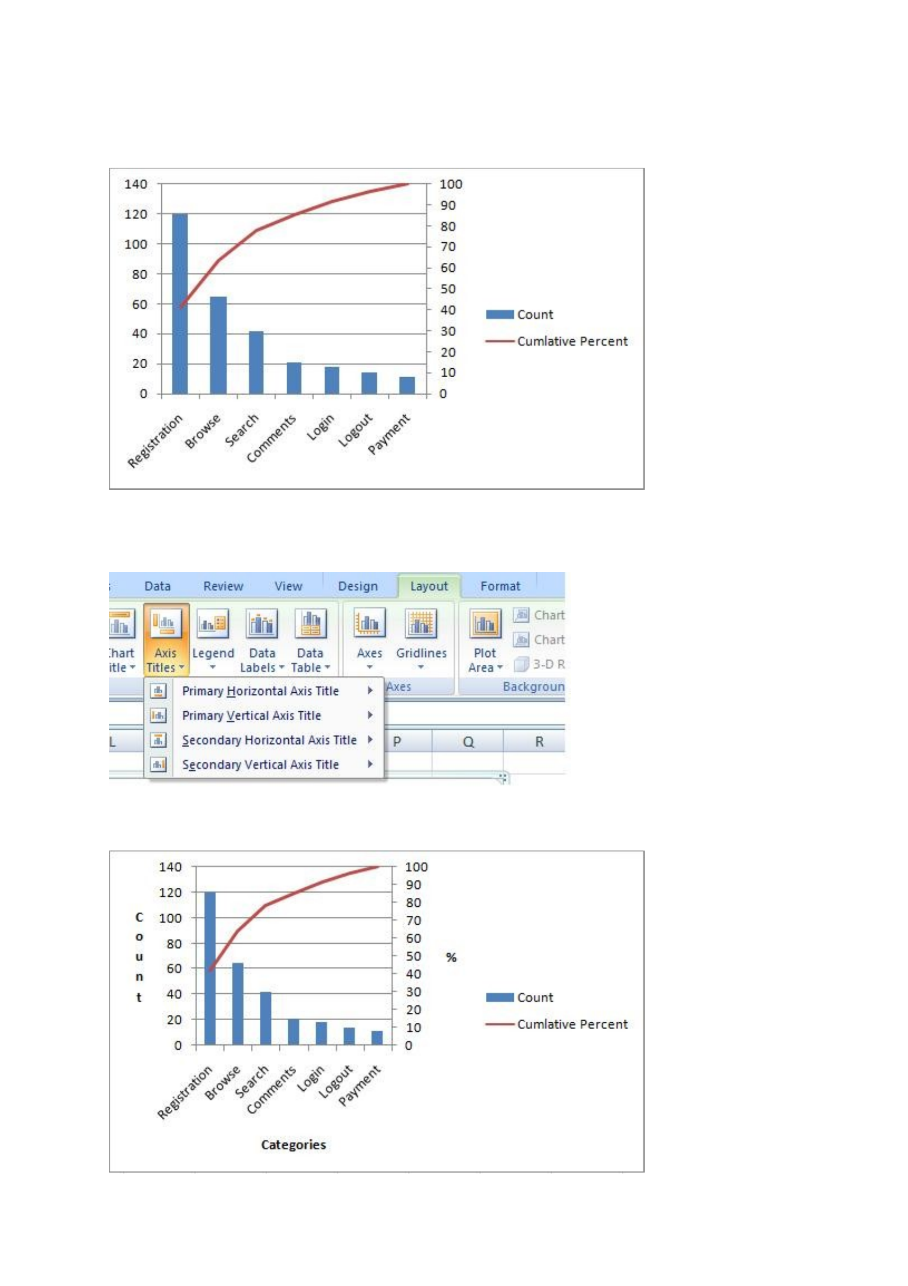
We are almost there. We just need to label our axis and we’re done. To do this select your chart,
choose the Layout tab, and select Axis Titles as shown in the picture below:
Congratulations! Your Excel Pareto Chart is complete, and should look as follows:


